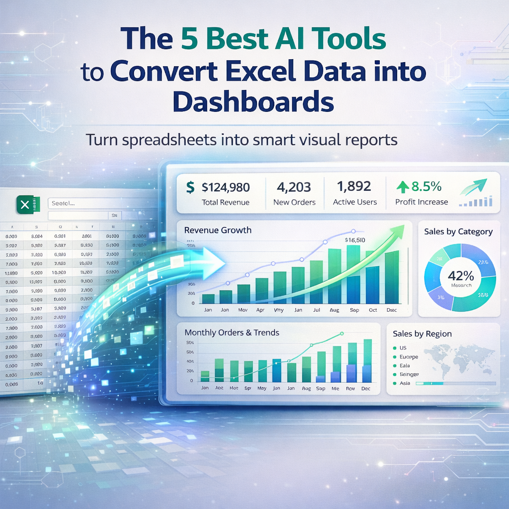
AI tools that change Excel data into dashboards use smart tech to make charts and graphs from numbers in spreadsheets. These tools look at the data and create views that show trends or totals in an easy way. In the USA, many people use them for business reports, school projects, or tracking personal goals. They help because you do not need to know complex codes or spend hours on designs. Just upload your Excel file and let the AI handle the rest.
These tools have improved a lot by 2026. They now add things like predictions or spot odd numbers on their own. For example, some suggest the best chart type based on what the data means. Others let you ask questions in plain words to get custom views. This makes data work faster for everyone, from small shop owners to big company teams.
What Makes These Tools Stand Out?
Good AI tools for this job connect well with Excel files. They clean up messy data first, like fixing dates or removing blanks. Then they build dashboards with colors and shapes that make sense. In the USA, tools that work with other Microsoft apps are popular because many use Office suites.
According to Powerdrill, tools like these focus on turning raw numbers into stories with pictures. They save time by doing the hard parts. A user on Reddit shared that simple AI can make quick charts from spreadsheets. On X, ScriptDataInsights talked about tools that bundle dashboards with code for better results.
The Top 5 Tools
We looked at many options and picked these five based on how easy they are, what features they have, and user feedback. They all work with Excel data and create dashboards.
Power BI
Power BI is a tool from Microsoft that turns Excel data into live dashboards. It pulls in your spreadsheet and lets you drag items to make charts. The AI part spots trends and adds insights like why sales went up.
You can share these dashboards with teams or put them on websites. It works well with other Microsoft tools, so if you use Teams or Outlook, it fits right in. Features include real-time updates, so if data changes in Excel, the dashboard refreshes. It also has maps for location data.
According to The Digital Project Manager, Power BI is great for Microsoft users with its $10 per user per month price. A post on Facebook mentions it for easy reporting from Excel. On Reddit, users say it is good for interactive charts. Pricing starts at $10 a month, with a free version for basics.
Power BI handles big files without slowing down. For USA businesses, it meets data rules like privacy laws. But it might need some learning for new users. Start with simple data to practice. In 2026, updates added more AI for asking questions like “show top sellers.”
Tableau
Tableau helps make dashboards from Excel by connecting to your file and suggesting visuals. Its AI looks at data types and picks charts like bars or pies. You can filter views to focus on parts, like one region.
This tool is strong for sharing. You can publish dashboards online or in apps. It has drag-and-drop, so no need for tech skills. Features include story points, where you build a sequence of views like a slideshow.
The Zoho site lists Tableau for its AI insights. Pricing is around $70 a month for creators. A user on Reddit praised it for complex charts. On X, Iván shared how similar tools saved time on reports.
Tableau works for teams in the USA who need pretty dashboards. It connects to many sources beyond Excel. Drawbacks include higher costs for small users. Try the free public version first. Updates in 2026 made AI better at natural questions.
Zoho Analytics
Zoho Analytics takes Excel data and builds AI dashboards with ease. It cleans data and suggests layouts. You can ask Zia, its AI, things like “trend by month” to get graphs.
It integrates with other Zoho apps for full business use. Features include alerts for changes and predictions for future data. Dashboards update live if connected.
According to Zoho, it has over 250 ways to change data. Pricing starts at $24 a month. A post on Facebook highlights it for analytics. On Reddit, users like its cleaning tools.
For USA small businesses, Zoho is affordable and secure. It handles mobile views well. But advanced features need paid plans. Test with free tier. In 2026, Zia got smarter at stories.
Ajelix
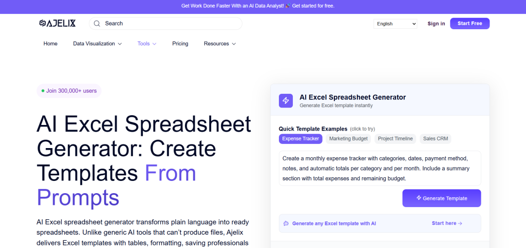
Ajelix is an AI platform for Excel tasks, including dashboard making. It generates charts from data and adds analytics. You upload Excel and get visuals fast.
Features include formula help and code for automation. It has conversational AI for questions.
Datarails notes its dashboard generator. Plans from $75 a year. A user on Reddit recommended it for formulas. On X, Vijay asked about similar free tools.
Ajelix suits USA users who want all-in-one. It translates files too. Costs add up for teams. Free basics available. 2026 updates improved graphs.
Polymer
Polymer changes Excel into interactive dashboards with AI tagging. It discovers patterns and builds pivots.
You search data like a web engine. Features include sharing and embeds.
Powerdrill calls it good for dashboards. Monthly subs. A post on Facebook mentions analysis tools. On Reddit, users suggest similar for cleaning.
Looking for an Unlimited, Free AI That Can Do Excel & Data Analysis – Serious Help Needed! 🤯
by inautomation
Polymer is fast for USA marketers. It handles tags well. Might lack deep stats. Try demo. 2026 made it better at predictions.
Comparing the Tools
Here is a table to show differences:
| Tool | Main Feature | Starting Price | Best For |
|---|---|---|---|
| Power BI | Real-time updates | $10/month | Microsoft users |
| Tableau | Drag-and-drop | $70/month | Visual stories |
| Zoho Analytics | AI questions | $24/month | Small businesses |
| Ajelix | Formula help | $75/year | All-in-one |
| Polymer | Data search | Monthly sub | Quick insights |
According to Knack, such comparisons help choose.
How to Get Started?
Pick based on your data size. For big Excel, Power BI works well. Test connections first.
Upload clean data for best results. Add descriptions for AI suggestions.
A post on X shares prompts for dashboards. On Reddit, users discuss automation.
How I use ChatGPT to automate Excel dashboards and clean up hours of manual work
byu/ExcelerateAI inChatGPTPromptGenius
Tips for Better Dashboards
Use colors that match your brand. Keep it simple with few charts.
Ask AI for trends to add value. Share securely.
According to HubSpot Blog, tools like these cut time. A Facebook group lists AI for reports.
Challenges You Might Face
Data might not load if too big. Fix by splitting files.
AI suggestions could miss context. Edit manually.
On Reddit, users note limits. A post on X talks about campaign dashboards.
Future Updates
In 2026, tools will add more voice commands. Dashboards will predict better.
ThoughtSpot predicts AI growth. A Facebook post mentions manipulation tools.
Wrapping It Up
These tools make Excel data into useful dashboards. Power BI fits Microsoft fans. Tableau shines in visuals. Zoho is easy for starters. Ajelix handles extras. Polymer is quick.
Try free versions. You will see data in new ways soon.